

The new branding by Interbrand will be used starting from July 2017. Many fans liked it, a lot of them didn’t, we’ll tell you later what we think about it. But there is one thing we know for sure: No Football club in the world has ever made such fundamentally brave rebranding.
A rebranding and the logo: no more zebras, bulls and horses.
If you take a look at the old logos, you’ll notice a lot of details that have been lost. A pity? I don’t think so: there where zebras, bulls, horses… they could have filled a whole zoo. Nobody really knew what animal should represent the most rewarded Club in Italy. Oh, when they where sponsored by Puma there was a puma on their Jersey too.
![]()
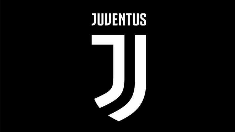
The new logotype represents Juventus in its prime essence: the J of its name, the stripes of its jersey, and the Scudetto shield. It recalls a famous line from one of the Juventus’ legendary former managers, Gianni Agnelli: “I get excited every time I see a word beginning with J in the news.”

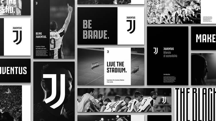
There is more to branding than the logo.
Interbrand, the agency who did the rebranding says: “The new identity […] captures the DNA of the Juventus Football Club’s aesthetic and sculpts it into the sharp lines of a strong mark, iconic and essential, capable of setting itself as the protagonist in any context and on any interface.”
Everybody is talking about the new logo. It might be hard to swallow (I am not even sure, if I like it), but it needs to be seen in a context. If you look at it in the context, it starts to make more sense:

The soccer world and branding anarchy
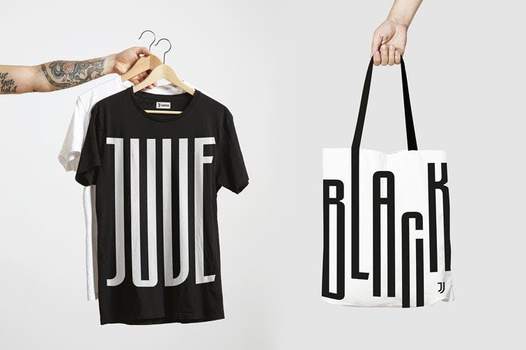
If you look at what Juve has done till now or what other soccer clubs have, you’ll see there are NO rules in terms of graphic design. We could call it The Branding Anarchy. We have found 13 different Fonts just looking at a few merchandising products from Juventus. Not to mention other Serie A clubs.
![]()
Money rules the soccer world
It is very clear that the company wants the new brand to become an important fashion label other than a successful Football club. But at this moment the new branding might be a little bit too much about fashion. Juventus must be careful not to forget about its fans and work a lot on and with its “tifoseria” in order to keep the team spirit alive.
In a soccer world that is getting more and more dominated by commercial domains, money sets the new rules and this rebranding is a perfect representation of such transformation.
There is no doubt that this rebranding will have a positive impact on the overall brand value. This is why we think that many other clubs are going to follow soon. The initial doubts about the new logo will very soon be forgotten and it will be remembered as the biggest rebranding football has ever seen till today.


