When it comes to Web Design, everybody has his or her own opinion. That’s normal because every website is a complex entity, comprised of hundreds of details. It’s easy to get lost in subjective tastes or new design trends.
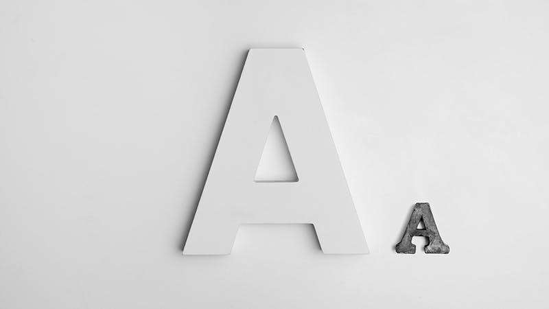
But one thing is for sure: humans don’t visit websites just for visual layouts – they want content. This is why one fundamental aspect of website design is displaying your content in a simple and direct manner. And text readability has an important role in that.
That’s why we’ve come up with a simple and direct checklist for you to improve long text readability!
1 – Get the font size right (yeah, it’s important).
This might be the vital aspect regarding the readability of your longer texts. The font shouldn’t be too big but – most importantly – never too small. Consider that not everyone out there has the same eyesight!
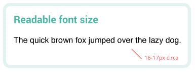
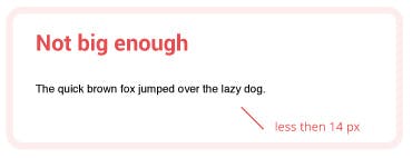
The perfect size can vary on devices and font families, but a font should never be smaller than 14px. The best practice is to use the size range from 16px to 18px for longer texts!
2 – What font should I be using?
Generally speaking, using many different font families (aka typefaces) is never a good idea. It can lead to visual inconsistency and is bad for readability. Keep in mind that 3 font families should be the absolute maximum for any project.
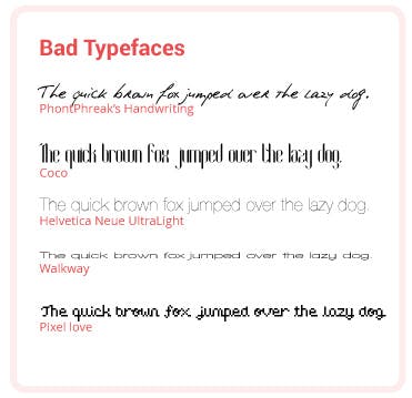
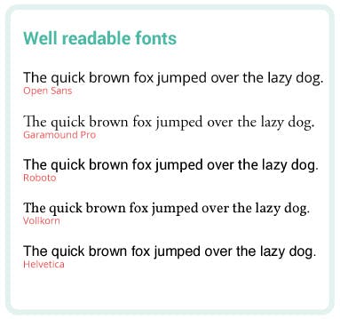
While you can be quite fancy with titles, there are some specific font families that should be avoided in longer texts. Luckily there are also those with good readability (or legibility) we can recommend:
Good readability fonts
Helvetica/Helvetica Neue, Meta, Gill Sans, Rotis, Arial, ITC Officina Sans, Futura, Bold Italic Techno, FF Info, Mrs Eaves, Swiss, TheSans, Times New Roman, Titillium, Droid Sans Font, Raleway, Noto Sans, Ubuntu, Exo Font, Source Sans Pro, PT Sans, Lato, Open Sans)
Unreadable fonts
Montag, Aviano, Terfens, Florencia, Soho, Comic Sans, Vasarely, Erased Remington, Joufflou NF, Hive Mind, CA BND Trash, Argonautica, Diode, Monkey Insinuation, EF Badblocks, Cubie, Gottar, ALT Re32, Foreign Language, Mogzilla NF, Gf Spacetrash, Vortex, Sergury, Zebraw, FlagDay, Porker, Tsunami, FF GeäbOil, Bokonon, Papyrus, Curlz, Bleeding Cowboys, Emilys Candy, Creepster, Kristen ITC, Rock Show Whiplash, Impact, Bradley Hand
Of course, this list is not complete but you can check if your main font belongs to one of these two categories and find out if you’re going in the right direction!
3 – Bold, italic, ALL CAPS and underlined text?
Generally speaking, we can say that they should be used as little as possible. They are tools for accentuation. Remember that when everything is emphasized, nothing is emphasized. Still, the emphasis done well can help you direct your user’s attention towards the most important part of your text.
Emboldening
We know that people generally don’t read all the text on a page right away. They scan downwards to find the part they are interested in. Jumping from title to title, from subtitle to sentence, they read some single words inside a paragraph. This is why using some bold or italic words here and there will help people find what they want.
ALL CAPS
Many websites use all caps on titles, and that’s OK because titles are short and should be emphasized. BUT YOU SHOULD NEVER USE ALL CAPS ON LONGER PARAGRAPHS. This is a real readability killer and makes you look like you are screaming like crazy. Please, you don’t want to do that.
Underlining
What about underlining? As you know many websites underline the links. Over the years people got used to this pattern. Underlining the text subconsciously tells us that it is clickable. That’s the reason why the best practice to follow is to never use underlining for non-linking text. We don’t want to confuse the user.
4 – Text alignment and readability
Sometimes we find whole justified texts on the web. Their main problem is often uneven spacing between letters and words. It’s what makes them hard to read and confuses the human eye. Furthermore, people use different line lengths to jump from one line to another while reading a text. By justifying all the lines their length will be the same making it harder for people start a new line. That’s why entire justified texts should be avoided anytime!
What about centered text alignment? Well.. it can be pleasant when used on some short and slim paragraphs, but still, there are some major issues with it. Since the starting point of each line changes, this kind of alignment forces the users to work harder to find where each line begins and continue the read.
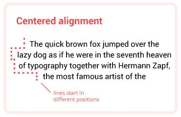
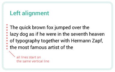
So… what kind of alignment should I use? We live in an occidental part of the world where people are used to reading from left to right. This makes the left-aligned text a very common and appreciated arrangement. It helps the user scan the text following the F-pattern and allows him to avoid major readability issues.
5 – Give your text some air to breathe!
Always remember that every good layout uses a certain amount of white space around all graphical elements.
- This includes spacing between text lines: It might be different depending on the font but as a general rule of thumb, we would recommend that it should never be under a minimum of 1.2em or over a maximum of 1.8em.
- When you have long texts it is a best practice to visually divide one paragraph from the other to improve readability and tell the user where a new topic starts. Also, try keeping paragraphs within a maximum height of circa 5 lines.
- The space between letters is usually called “tracking” and affects legibility too. We could say that tight letter-spacing will diminish legibility and adding minimal letter-spacing will improve it. But too much space may isolate individual letters and make it harder for the user to visualize words and whole phrases. As a best practice avoid modifying letter spacing of more than 0.5px in any direction.
—
Keep these in mind to boost readability!
As readability is a fundamental part of website design, these were our top 5 tips! Even more things affect readability, like contrast, an other issue we would like to talk about here soon, just let us know if you want to know more about it. For now we hope you’ve learned something new today and found some new inputs for your project! What are you currently working on? Let us know what you think below!
If you are interested Usability and UX/UI you can check out these articles:
How to find a font you cannot recognize?
How to increase conversions with heat maps