

SUMMARY: following an organized method divided into 6 main steps and asking for feedbacks and approval from the client is the only way to deliver a successful design project.
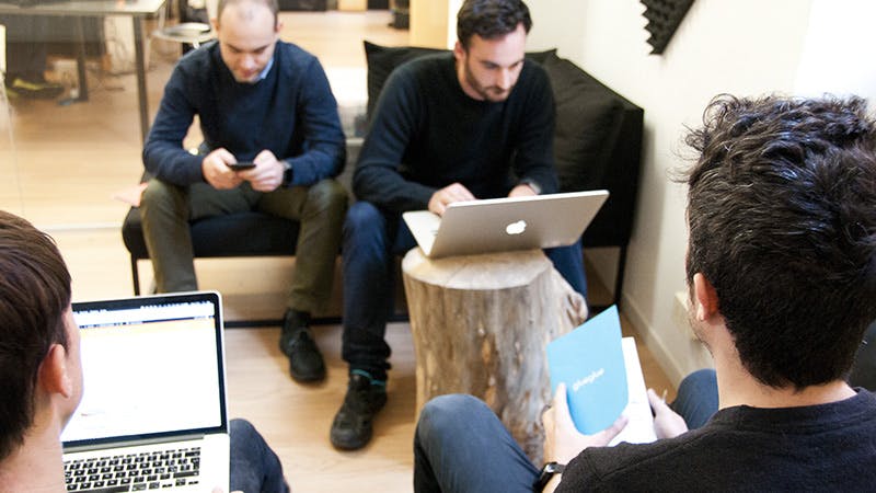
When we started glueglue as a ux design agency over ten years ago, we made many decisions, especially during first projects, that were based more on intuition than logic.
This is probably because our job has a creative component that naturally permeates every area. While that could be considered a positive thing, we have found ourselves struggling over the years to subvert such strategy and define a well-structured approach for the design process.
Our working method is constantly evolving through ever-present successes and mistakes we experience almost every day at the agency.
We tested and tried many different approaches and grouped them into 6 main areas. We follow this guideline during most project kickoffs.
1 briefing
This is the very first moment when you explore the client’s goals and vision for the project. Hopefully. It is not rare to meet companies that want to start something without a clear idea in mind. Probably because there’s someone in the managament pushing to finally take action. Be very careful because this crucial and delicate step determines a precise expectation of your involvement.
Please do not close the meeting by just noting that the goal of the design is just to ‘Make a restyle of the website ’ or ‘increase the sales’.
It is fundamental that the final output of the first phase is be defined by simple and straightforward common goal. It will be a clear point of reference during each step of the whole project facilitating the evaluation of your work at the end of the game.
If you don’t delve deeper into the current state analysis and name the real goals, you’ll probably get stuck in a game that’s hard to win. Don’t be afraid to have questions, this is the only way you have to achieve a well-structured briefing output.
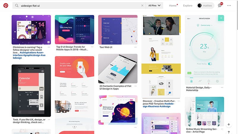
2 research
Some agencies or professionals often overlook this part of the design process. Perhaps they just want to make something that’s unique or because they do not want to be too influenced by other projects while making decisions. From my experience, I can honestly say all the projects which overlooked research phase led to a lot more iterations and reviews than the ones that saw it as a crucial part of the process.
This doesn’t mean to look only at your competitor’s products. Having a closer look at different markets and patterns is what can make the real difference.
Like it or not, we are always influenced by what we use and see every day around us. Having control on this decisions is productive in terms of anticipating mistakes and quickly solving problems that others already solved. This does not mean to look only at your competitor’s products. Having a closer look at different markets and importing new design patterns and frameworks could make the real difference.
Here at glueglue, we have defined our own UX review method based on the Heuristic evaluation. It’s incredibly useful when we have to improve a digital product that’s already on the market. The method analyzes 10 areas by assigning each one a score. That helps us saving time and effort by focusing on what’s really important. Overall, having a broad and wide view is the key. Recently I’ve inspired myself from a meeting scheduling app to design a new travel booking system.
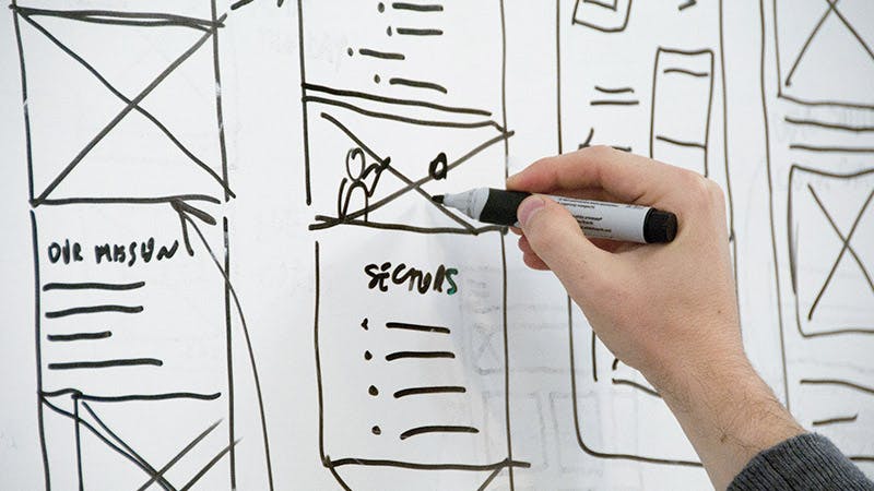
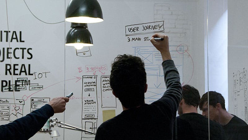
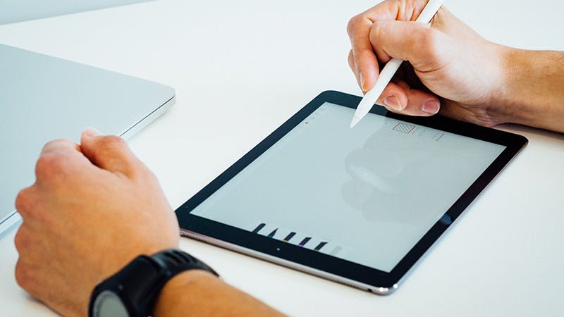
3 wireframe
The third step of the design process could be seen as unnecessary or time-consuming but I would say it’s totally the opposite. The goal of this step is to define the features and functionalities of your digital product, understand which are the best patterns to use and experiment with different solutions without spending too much time on the details.
Here we need to focus on layout structures and features first rather than the aesthetics…
You’ll probably start by just making some sketches (see the picture above of a messy wireframing session at glueglue studio 😉) and then use Sketch or your favorite design tool to conceive them digitally and share them with the client. Why? Because you definitely need to get precise feedback and understand if you’re on the same page before starting to tackle the visual part.
I usually introduce my wireframes with something like ‘they’re ugly by purpose, we need to focus on layout structures and features first rather than the aesthetics…’
4 design
The fun part every designer can’t wait for since the beginning of a project. If you didn’t skip a step on the way, it should be a great pleasure as the hard job is already done.
Design at least 3 proposals and ask for the progress feedback. Make the client part of the decision process
Consider brand guidelines for color palettes and logos, and get inspirations from other companies’ products always considering that a good digital interface should have the right aesthetic & functional balance. Try to design at least 3 proposals and ask for the progress feedback. Make the client part of the decision process.
I usually design with Sketch and share my creations on Zeplin or Invision depending on the type of product I am working on. Zeplin is great for structured products when getting feedback is the main purpose, while Invision helps to focus on the user flow. Apps are constantly evolving adding numerous features and options so keep your eyes open 😉
The goal of this step is to get precise feedback on the overall look and feel and the visuals to come up with a final approved version of the design before passing it on to developers.
5 prototype
This is the step of the design process that makes things 100% clear in terms of the user flow and interactions. If you have time (and a budget of course) to produce a fully interactive prototype of your new digital product (using, for example, InVision) you’ll never regret it.
The main goal here is to represent the trickiest of interactions
Also, brand new product prototypes are a great way to test the product by the real users before even developing it. You anticipate possible design mistakes and introduce the improvements before going online. This can save time and money for your client. The main goal here is to represent the trickiest of interactions and avoid misunderstandings with developers who will never ask you: ‘what happens when I click here or there?….’
6 test
So, you have done your job (almost) since you have your product live and polished. But do people use it as expected? The answer that comes from our experience is: probably NO!
There’s an infinite number of creative ways people can interact with an interface…
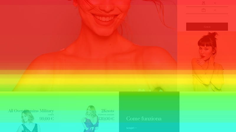
That’s normal though, there’s an infinite number of creative ways people can interact with an interface and some Hotjar recordings can help with that of course. It is a freemium tool that records the behavior of real users on your digital product and is an easy and affordable way to have a first look on what’s happening and if there are potential problems with the product itself.
Of course, live testing is also a good choice but also far more expensive and structured.
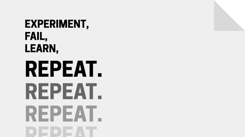
7… repeat
Did we say 6 steps of a design process? Well, this is a not a proper step, it is something that’s virtually perpetual. We always consider a digital product as a work in progress that’s never finished.
Everything changes. From competitors to user needs and behaviors
That’s why we perform 3-month insight reports on our clients’ products. It’s a great way to evaluate introduce effective UX improvements. Why? Because everything changes – from competitors to user needs and behaviors and we have to adjust our product too if we want to stay in the game.
We can say that these are the steps that define our working process here at glueglue. What about you? Do you have any additional step or detail that makes your design process unique? Please share 😉
———-


