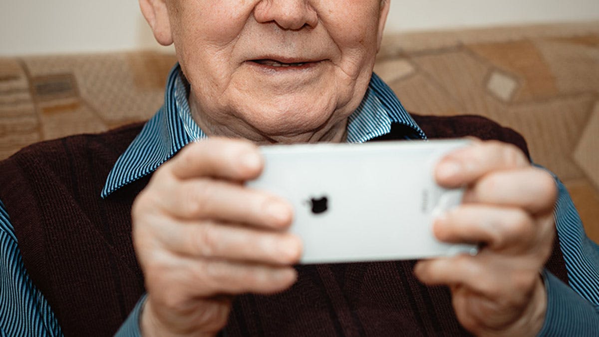
Designing apps and products for the elderly is an increasingly common opportunity in this complex historical context. Over the years, designing for digital natives, i.e., the youngest generations who are becoming familiar with digital tools as play and growth support, has captured the attention of all us designers. Participating in such a remarkable paradigm shift has generated a lot of interest and a kind of widespread fascination - futuristic times finally becoming a reality. Even better, they become a reality thanks to the work of designers, UX experts, and a diverse crew of hybrid and sophisticated technicians, true pioneers, and sometimes revolutionaries.
In this exciting landscape, due to a somewhat naive distraction, the concerns of the older generations have been forgotten.
Nielsen's perspective on apps for the elderly
In a brilliant in-depth study by the Nielsen Norman Group on the usability of websites and apps for the elderly, the core issue is well grasped:
"Our recent research shows that digital products still discriminate against seniors. Content written for and by older people is difficult to find - when this content is available, it often treats seniors as a niche interest group rather than a diverse and growing demographic. By embracing both accessible design and an inclusive content strategy, online businesses can vastly expand the amount of business that they generate from this population."
It's not just a niche of users but a demographic segment destined to become increasingly relevant. According to the latest national data, individuals over 65 already represent a quarter of the population. Moreover, they are expected to comprise over one-third, reaching approximately 20 million people by 2050. This situation presents new challenges and opportunities, starting now.
At glueglue™, we are already aware of the importance of designing digital products based on the real needs of target audiences. In this sense, accessible and inclusive design establishes a solid foundation for the success of an application or web platform. And for us, success primarily means user adoption and satisfaction.
As explained by the professionals at Nielsen Norman Group, it is incorrect to assume that the elderly are disinterested in technology. On the contrary, when they are able to simplify their daily lives through the possibilities offered by technology, they are particularly motivated to change certain habits by integrating digital solutions.
Introducing UGO, the app that provides support and companionship to the elderly and disabled
During the complete redesign of the UGO platform, we explored the challenges and opportunities of a different user experience targeting the 65+ age group.
The goal of automating and streamlining the caregiver booking process led us to provide comprehensive answers to seemingly simple questions.
For the Italian app dedicated to the elderly, we delved into the characteristics of design and usability for seniors, identifying five guidelines. To make them even more effective, we transformed them into five questions forming an ideal reference checklist.
While working, it is essential to always keep in mind the end users who will be using the digital product. However, that alone is not enough to achieve a good final result. Responding to specific questions during the design of functionalities and flows guides the work like a compass. And as it is known, the compass reassures about the right direction taken.

credits: hrvoje grubisic
1 - Is this font really readable?
Major design systems like Google's Material Design include extremely small text sizes in their graphical components. It is not necessarily incorrect, but in general, it is important to prioritize readability for an elderly target audience.
In particular, the minimum font size should not be smaller than 16 pixels, with the option to adjust the font size within the interface. By doing so, maximum comfort can be offered to the user.
In the case of Ugo, we have chosen a readable font that is also fresh and contemporary. This way, we have achieved a dual objective: conveying professionalism and maintaining a friendly approach. What were the tangible consequences? Users immediately felt comfortable and continued their navigation.
credits: Sixtyfire
2 - Would my mother recognize this button?
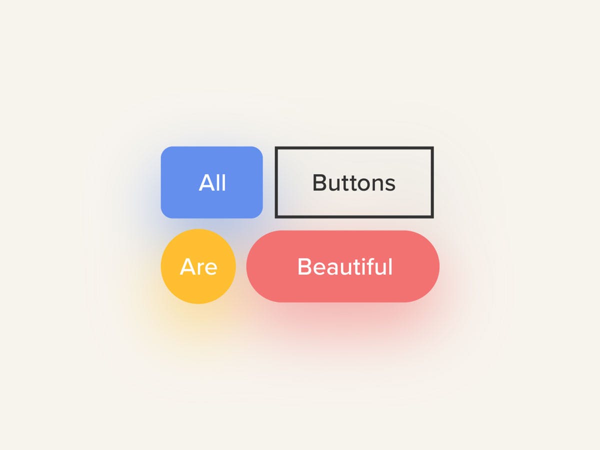
Round, square, rounded... they come in all shapes. The button is a graphical component that is often underestimated but crucial for conversion rates.
From our study, certain essential parameters have emerged that ensure the success of an interaction dynamic.
Button recognizability
The size of buttons should not be smaller than 44x44 pixels, preferably using the standard shape. In other words, the button should always be recognizable as such. If you want to experiment with a rhomboidal or creative button, perhaps it's better to reconsider.
Accessibility and contrast
The international reference for accessibility is represented by WCAG, the Web Content Accessibility Guidelines, which establish the minimum contrast for ideal readability. In the Ugo redesign process, we started with a yellow color defined by the client's guidelines. We then adjusted the Ugo palette to ensure optimal contrast and compliance with standards both within the interface components and in the text.
Credits: Hale Koksal
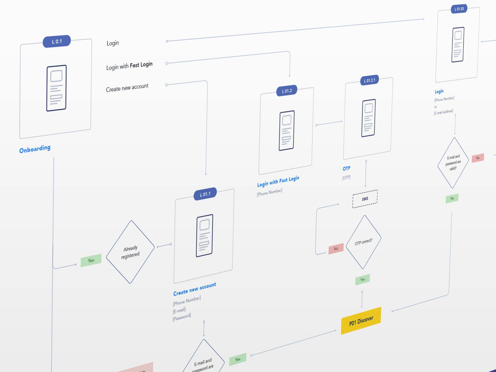
3 - Will the user over 65 understand what they need to do? How can we make an app for the elderly easy to use?
Regarding contextual aids, interesting insights have emerged. While the rule of 'Don't make me think' always applies, which suggests that cognitive load should generally be minimized, it is equally true that the elderly user tends to be very inclined to gather information before taking any online action. Therefore, to achieve a satisfactory UX, it is advisable to allow for in-depth explanations of certain steps through explanatory texts, even if they are lengthy.
We have adopted this explanatory approach as a reference best practice throughout the entire project development. Greater attention was necessary for the more critical steps.
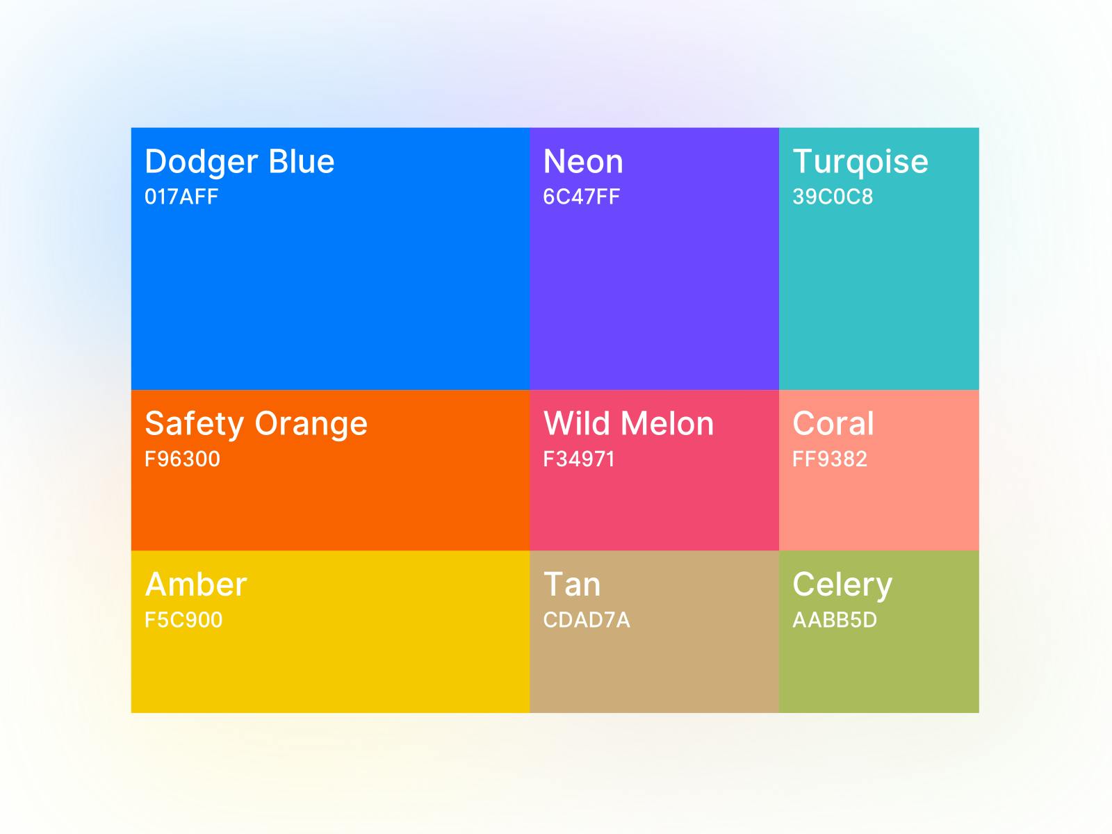
4 - Which color to prefer and how to communicate states?
As a universal reference, starting from the well-known traffic light, green, yellow, and red represent the recognized standard for communicating positive, transitional, or negative states. Rarely, in the apps we use, it is taken into account that a portion of the population may not be able to accurately perceive these chromatic differences. In apps for the elderly, this lack of attention can be fatal.
In the case of Ugo, we followed a special rule: pairing each color with a representative icon for each state, serving as a clarifying element. In particular, to clearly communicate errors, we used color, labels, and icons simultaneously.
5 - Icons: yes or no?
Hamburger menu? It is not contraindicated, but a descriptive label should be added. Icons should not be avoided a priori, on the contrary. As designers of digital products, we should consider icons as graphic elements that symbolize real-world objects.
It is excellent to use universally recognizable icons, such as the 'X' to delete something or an "!" to indicate an alert state. Going back to our friendly compass, to dispel any doubts, it can be helpful to ask: does this symbol exist in the real world too? If the answer is yes, then it can be used. Using that icon will provide added value in terms of recognition, thereby strengthening the usability of the product.
Discover in the dedicated Case Study on UGO what graphic and design choices we made, precisely by answering these questions.